


Project of the design identity of
a communication designer
a communication designer
Step 1 | What can i communicate?
Identify the peculiarities of the identity of a designer or movement or design group through structured research structured research that aims to focus on the distinctive elements that characterise their design practice in the socio economic context of reference.
Identify the peculiarities of the identity of a designer or movement or design group through structured research structured research that aims to focus on the distinctive elements that characterise their design practice in the socio economic context of reference.
Step 2 | Identify a visual code
a code constructed specifically to communicate
consistently the main concepts that characterise the identity
and peculiarities of the designer
a code constructed specifically to communicate
consistently the main concepts that characterise the identity
and peculiarities of the designer
Step 3 | Realising the identity poster
a system of communication artefacts capable of coherently communicating the content of the message, i.e. the main aspects of the authorʼs design practice identified.
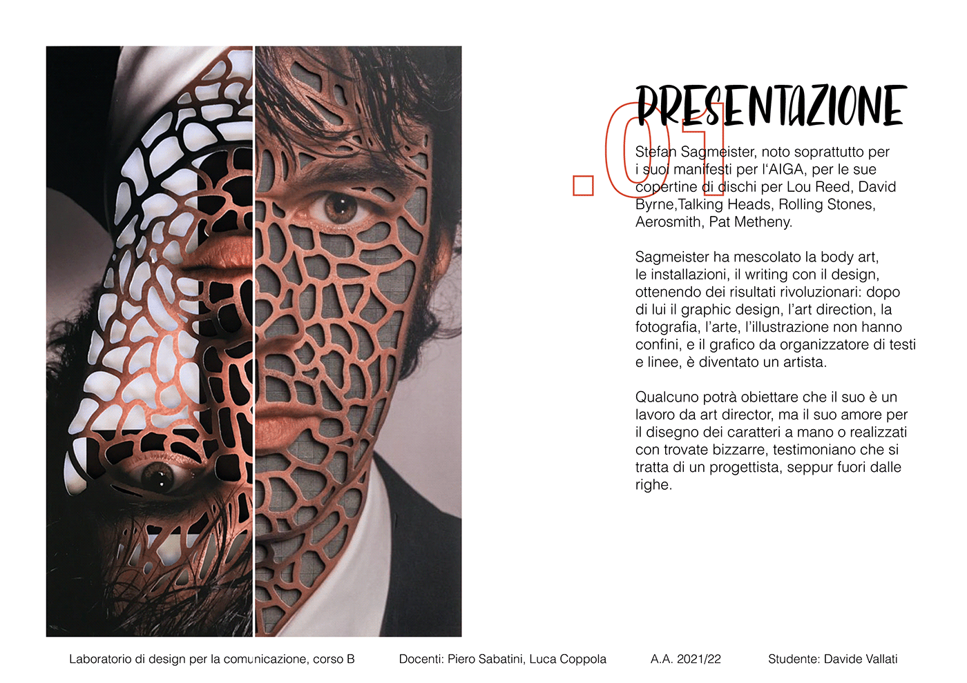
The designer I had to analyse, was Stefan Sagmeister

Sagmeister mixed body art, installations, writing with design, achieving revolutionary results: after him, graphic design, art direction, photography, art, illustration had no boundaries, and the graphic designer went from being an organiser of texts and lines to being an artist.
Some may object that his is an art director's job, but his love for drawing characters by hand or made with bizarre tricks, testify that he is he is a designer, albeit outside the lines.
He has managed to concentrate various artistic and cultural trends of the past decades, creating a particularly powerful visual language.
Furthermore, he usually focuses on strong themes such as sexuality, humour and human emotions in his work. human emotions in his work.
He can be defined with 5 adjectives:
- Polyhedral
- Sarcastic
- Irreverent
- Provocative
- Authorial
- Sarcastic
- Irreverent
- Provocative
- Authorial
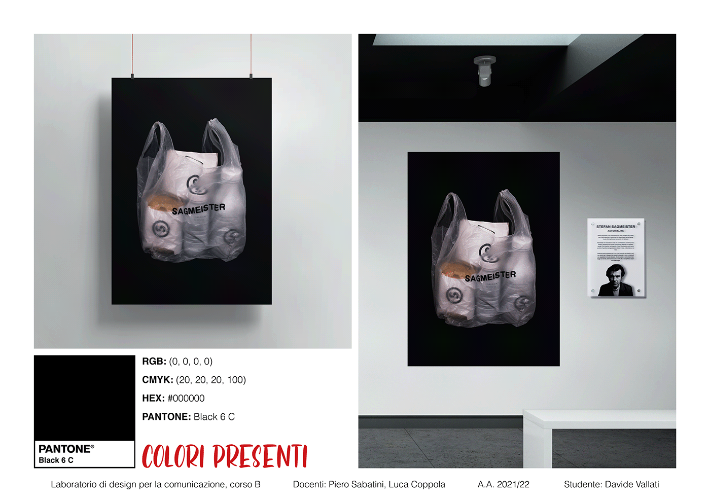
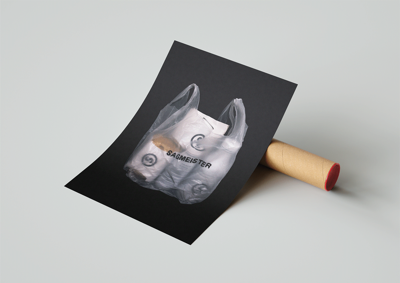
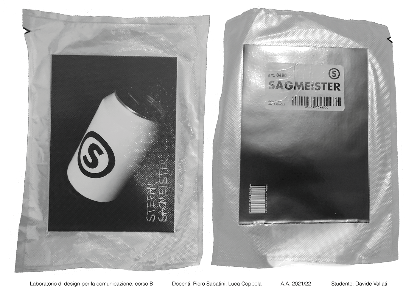
- POSTER -
Stefan Sagmeister, is a borderline figure with an almost artistic authorship, entering disruptively into the content of projects. He is a figure in whom the "I" is completely fused with the design. This also comes out of a culture of reaction to modernism.
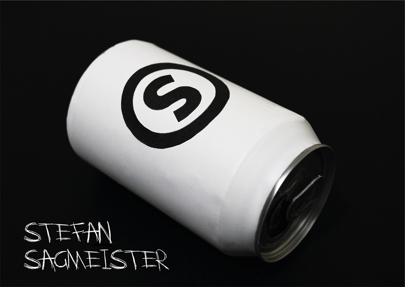
He is therefore a strong personality who brands everything he does, as if he himself were a brand.
He is therefore a strong personality who brands everything he does, as if he himself were a brand.
Hence the idea of the poster, which on a formal level, presents an envelope with 'Sagmeister' branded products inside. The photograph is a clean still life with a neutral background. The poster therefore has a reverse impact as it represents the opposite of what Sagmeister, which, on the contrary, has a strong aesthetic.

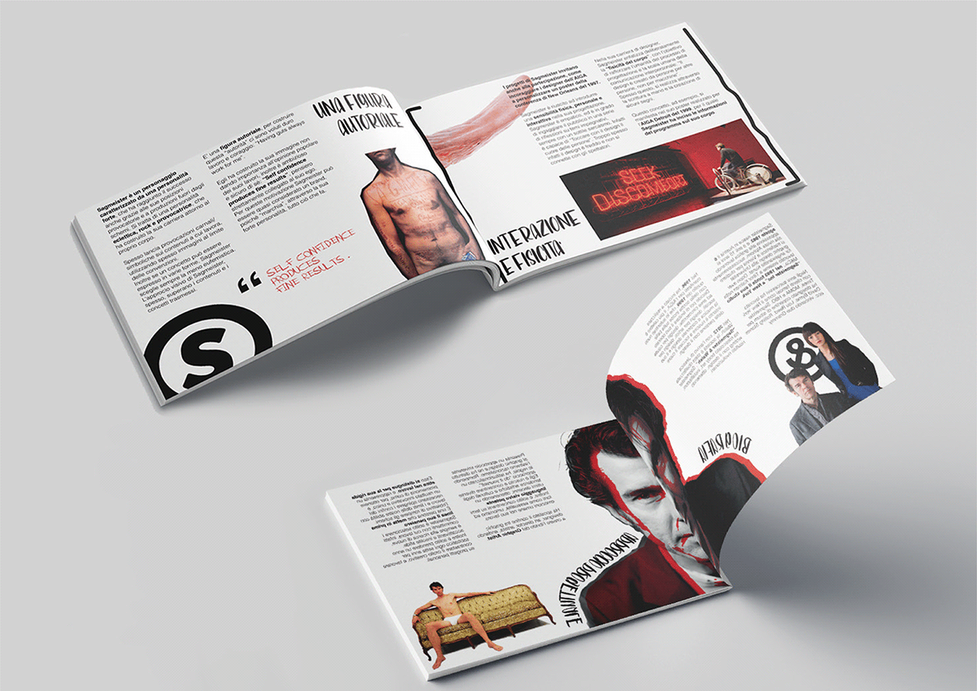
- SEDICESIMO -
The format used is 170 x 240 mm. The grid uses 6 columns and 6 rows with a spacing of 5 mm (Each photo below, represents 2 pages side-by-side).
The visual code of the sixteenth is consistent and presents continuity of thought with the remaining artefacts. The choice of composition seeks to coordinate with the identified attributes. Indeed, the sixteenth presents a dynamic and irreverent composition with the presence of images that refer to the designer's world.
Sarcastic elements stand out, such as the opening and closing receipts, materials put back into circulation in the sixteenth, as well as the cover, where there is a product inserted in the envelope. The sixteenth contains the designer at 360°, with texts and images relating to his characteristics, works and thoughts.


- overview presentation -


- VIDEOCLIP -
The dynamic manifesto incorporates and completes the discourse on authorship.
The explosion of the bag is basically intended to represent its reaction to this type of dissemination, i.e. to modernist formal simplification (coming out of a culture of reaction to modernism, recalled for example by the writing in Helvetica on the front of the envelope), and is also intended to represent its 'explosive force'.
The explosion of the bag is basically intended to represent its reaction to this type of dissemination, i.e. to modernist formal simplification (coming out of a culture of reaction to modernism, recalled for example by the writing in Helvetica on the front of the envelope), and is also intended to represent its 'explosive force'.
The film is accompanied by the soundtrack 'In the Hall of the Moountain King'. At the end of the video is a quote, which contextualises the theme: 'Self confidence produces fine results', a phrase mirror of his ego.


